One of my last projects will working at ii.co.uk was a complex one which involved a number of design steps in a highly constrained timeframe. The objective of the project was to retire a legacy virtual investment portfolio (VP), due to both hardware and software issues and build a new VP within our React web app.
A VP is an investing tool which behaves like a manual database for users. The user generated data is then enriched with live market data to simulate a real money investment portfolio.
project design steps
Problem definition
The first and greatest problem we faced was limited time. We had two development sprints (4 weeks) to build and only 1 design sprint to do as much work as we could. We were retiring a long serving website with significant accumulated VP functionality. In practice this meant replacing the previous architecture with a new stack, different market data and a narrower set of supported instruments.
This plan would also necessitate a migration of around 100,000 user records into a new authorisation (auth) system, which in turn would require new log-in factors. Finally it was also decided early on that due to performance concerns, the new VP would no longer offer the unlimited rows functionality of the old system. This gave us an added communication problem.
Journey mapping & User engagement
Given the time constraints, the research phase focused on understanding what the experience of the current VP app was and which features were used heavily. We also wanted to speak to our users and ask them what they were using the VP for and why they chose to use ii's VP.
Below is a journey map I did which shows the various pages, actions and connections present in the legacy VP app. From here we knew we faced tough decisions on which functionality to build into an MVP.
Virtual portfolio journey map
Before we started engagement with our users we formed the hypothesis that the majority of our users were using VPs either to test out potential investments/portfolio combinations or to manually replicate real money portfolios held elsewhere. From here we wrote up a series of key questions, where answers would guide us to a workable design.
VP questions & proposed user inputs
To test this hypothesis and answer our questions, we conducted a number of phone calls to VP users as well as author a post on our community forum.
- N.B. This community was conceived by me a year prior as a way to have long-form interaction with our users on a public domain.
Community post title with replies/reads
The above community post as well as the calls revealed some surprising "hidden jobs"...
Whilst many were using the VP in ways consistent with our hypothesis, there were a significant number who were doing things we had not envisioned:
1. Many were adding instruments with zero values to create a basic watchlist.
2. Others were logging the same instrument multiple times to reflect every transaction made in a real money portfolio...essentially manufacturing a virtual transaction history.
These two findings, among others, had a significant bearing on our subsequent product prioritisation and design work.
Prioritisation & Initial design
The team knew that we would need to focus on core VP functionality for initial launch, so it was decided that we would design a VP that was optimised for performance and usage speed. We knew that much loved features, such as content activity alerts and bulk edit would have to come later due to API constraints.
Our design should as such needed to consider:
1. First touch migration journey
2. Quick addition to VP from a number of locations
3. A similar table pattern to our trading platform (for continuity)
3. Efficient edit flows
4. Communication around narrower instrument set and VP limit constraints
Here are a few of my low-fi assets:
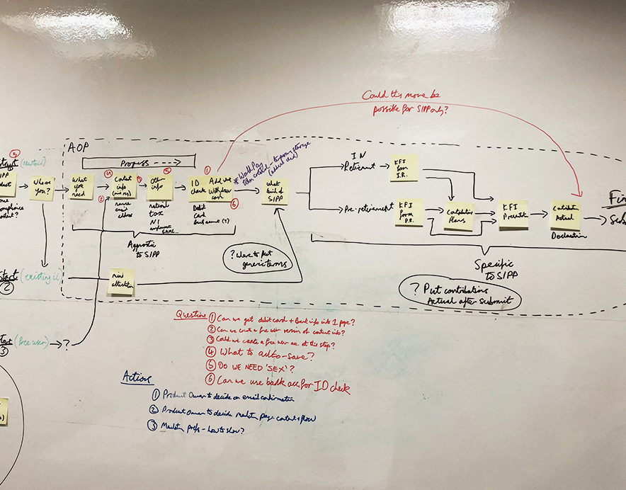
VP/Research user 1st touch migration journey
VP MVP wireflow
Concept sketch for VP edit view
In addition to low-fi work, I also did a range of concept prototypes to show both users for feedback and our devs to assess data use and pattern feasibility.
The VP Watchlist and Sidebar concepts we a direct response to the hidden task of wanting to "just watch" and one of the identified pain points around users struggling to be able to quickly get prices on followed/held instruments from anywhere within the web app:
Watchlist concept
Watchlist sidebar + toolbar nav concept
Dev feasibility & Prototyping
The combination of the wireflows, sketches and concept designs allowed the team to have fairly detailed architectural discussions about the required APIs and database setup. We also did a story mapping session, which along with high level effort sizing, enabled us to set our MVP scope.
Epic level story mapping & estimation
Unfortunately the watchlist and sidebar concepts were not taken forward to prototype. Due to the lack of build time.
With the scope agreed I focused on producing a set of hi-fi designs for prototype presentation to stakeholders and users. If unchallenged these would then also form the basis of my dev-handoff artefacts.
Migration first touch
Performance & comparison tables for companies
Instrument search for VP
Add to virtual portfolio modal
.gif showing add to VP flow from zero state
A more complete set of hi-fi designs for virtual portfolio can be seen here.
Following the creation of the initial design prototypes, we again looked to gather opinion and feedback from both stakeholders and users.
I wrote a design preview community post. Which as expected surfaced a number of concerns about functionality shortfall. Although I did argue that we should do a pre-launch design iteration based on this feedback, the team felt that scope change at this stage would be too great a risk to the user migration.
Additionally our internal stakeholders were for the most part focused on continuity with trading portfolio and as such were satisfied with the proposed designs.
Design preview post title with replies/reads
Post launch feedback & retrospective
The project was completed on time and the engineering team did an excellent job with building out the APIs, DBs and the React front-end. Our marketing team were also helpful partners when it came to communicating the differences and limitations to our customers.
However the migration was perhaps unsurprisingly not without data and auth issues, which created a lot of contacts and negative feedback in the days following the launch.
Once the dust of the migration settled I set about investigating the kinds of user feedback we had received and propose design iterations for development consideration.
The feedback we received mostly fell into three camps:
1. The responsive design of the main data table, which for dev speed, was simply side scrolling was inefficient and frustrating to use.
2. The new VP showed less data than the previous version.
3. The new VP did not show price and content alerts like the previous version.
All three of these issues had come up in testing prior to launch but there was insufficient time to develop to include them. Though I did produce a set of designs iterations to address 1 & 3 (see below), which are currently sitting in the backlog.
Point 2 will require further investigation and likely an alternative pattern for tabular data presentation. Potentially we should consider user level table customisation with stored choices.
This project went well in many respects, however looking back I should have argued to start the design phase earlier in order to discover more feedback prior to scope finalisation.
The migration complexity was also not given enough respect. I will certainly keep this last point in mind the next time I am involved in a customer data migration...


