Fonoa is a fintech scale-up with a suite of products enabling the enterprise with large cross boarder operations to better manage their indirect tax compliance and reporting. When I joined Fonoa in Q1 2022, the five products were just starting to generate revenue. However there were fundamental problems that were limiting both further commercial success and operational efficiency. 
At the heart of the problems was the siloed nature of each API first product. My task was to investigate cause and effect of the silos, from which I could make strategy recommendations and following this, take on design aspects of execution.
Siloed product genesis
Siloed products are a fairly common phenomenon in my experience. That said, as I was new to the company at the time I wanted to investigate the genesis of the products to understand how they became so separated and what the impact was.
Causes
From desk research and colleague interviews it quickly become clear that products were siloed expressly as a consequence of both company culture and ways of working. 
Fonoa is a remote first company which champions asynchronous communication, to the extent that synchronous communication is actively discouraged wherever possible. There is also a behavioural focus on speed of action, manifesting in a literal urgency to build and release product. The exco narrative here being that we are in a race with competitors, where the first mover advantage is equivalent to winner takes all.
Product teams were understandably directed to laser focus on revenue generation for their product. Though a suboptimal outcome of this focus was less of an incentive to consider product interoperability or concern for UX consistency, for example.
From a technology and systems perspective, the first products took shape before there was a CTO. Though later when a CTO was installed, little in the way of guidelines or standards were introduced. Except for a single edict that decisions on architecture and implementation should favour in all cases the choice which removes or reduces dependency between product teams. Ostensibly to further increase speed of execution and reduce time to revenue. 
One further key technology decision here, which had a compounding effect, was the ruling that no releases may have breaking changes and backwards compatibility must always be maintained. While this decision had good justification - chiefly that client teams lacked standing technical resources to manage an upgrade path - it did mean that once there was a gap between products, closing it was difficult and slow moving.

Siloed products - causes

Effects
While there is no doubt that many of the choices made helped Fonoa get to product-market-fit for individual products earlier, it was also clear that there were trade-offs. 
Fonoa's products are used by tax and finance teams within medium to large size enterprises. These teams are cost centres, which unlike revenue generating teams, invariably do not have standing engineering resources to conduct API integrations. While each of Fonoa's products offer conceptually simple APIs to integrate with, the challenge becomes more about providing the Fonoa APIs with the right data and then processing the response. Given that each product has a separate client facing API, the effort to integrate multiple products increases linearly with minimal integration economies available.
Having performed basic integrations, each client must themselves manage the orchestration of data between Fonoa's products as the response from one product will either be a trigger or an input parameter for another. In addition should the client wish to introduce any conditional logic within their processing then this is on the client to either build or connect up an appropriate workflow engine. 
On the UX side while Fonoa does provide a unified operations dashboard app, in practice the only unification across products is a single-sign-in and common design system. Each product occupies a separate space within the app. Each also has an individual approach to data naming (due to API inconsistencies), content hierarchy and interaction patterns. However most troubling from a strategic point of view is that the app provides little value-add to users beyond displaying lists and details for individual operations. In effect the product experience is that of a basic calculator which performs well but does not provide any insights or top-down outcome awareness from the data in aggregate.
A further facet of Fonoa's proposition is ongoing client service. Given the users are not technical and the considerable data throughput, there is an ongoing need to provide client support and data intervention processes across the products. As is common, the client service team at Fonoa operates horizontally across products. The team were very vocal in explaining their frustrations at having next to no self-service tooling and instead needing to log directly into separate cloud db admin consoles to troubleshoot issues. In all cases if an action was required then a request ticket to engineering would need to be logged. At the level of a single product this was not ideal but manageable. However task management and ultimately serving clients across multiple products was riddled with inefficiency. 
The net result of effects across product, UX and CX stands was that our revenue team struggled to cross sell our products. Given the high levels of incumbent market penetration and the long sales cycles our ability to get early adopters to take multiple products was key to achieving our revenue targets. Beyond the cross-sell difficulty there was also the top-of-funnel problem of increasing deal flow outside of tech-first platforms that we had had early success with. To get broader appeal within more traditional enterprise, we needed to both make integration easier and open up a pathway for integration partnerships with the big 4 consultancies that most of our ICP prospects were deeply embedded with.

Siloed products - effects

Strategy formation
The status quo strategy of build quickly and separately in order to get to PMF and revenue as quickly had worked well to get Fonoa to this point. Now however there was a need to alter course and create the necessary conditions to dramatically scale revenue. It was also evident that beyond top-line revenue metrics, increased attention to improving gross margin was now needed. 
Over a short period of internal discussion, debate and proposing it was agreed that revenue generation issues were symptomatic of the three root problem spaces and within these spaces there was a clear priority:
1. Lower integration barrier - to help grow sales funnel and improve conversion + cross-sell;
2. Unify UX and build data value add - make products more sticky, not just calculators;
3. Build support self-service tooling - increase customer satisfaction & reduce eng distractions. 
Architectural framework
The principal challenge in determining how to enable these three programmes to exist came down to the need to not disrupt the current ways of working and cultural practices. In effect this meant the need to create new architectural layers that will allow existing operations to continue with minimal change. Furthermore where any change was needed, for example to drive adoption of a new standard, incentivisation rather than mandate was to be preferred tactic. 

Original high level architecture

The architecture in place to this point was simple in the sense that you had the five products, each with separate APIs that handle both data writes and reads. You then have a single dashboard application, which based on email at login will direct the user to the right tenant data set. There is also no support for user edits of any data via the application.
Each product team is fully responsible for the manifestation of their product's data within the dashboard app and products do not communicate with each other in any way.

Newly proposed high level architecture

The proposed architecture preserves the integrity of each individual product but does require all products to beginning publishing events for all data operations. These events are published using a standard model catalogue and can be listened to by any consumer via a message bus. The proposal for data storage was that product specific DBs would be optimised for write speed and provide a fairly short term history (e.g. 1 year). By contrast an eventually consistent aggregation DB would be newly created with a longer history (2-3 years) and be structured to enable more complex reads - such as metric calculation and period comparison.
On the data ingest side the intention was to create a new layer to sit between the client data store - typically one or more ERP - and the Fonoa APIs. This ingest layer would have a short term memory to enable inter-product orchestration. Where such configuration would be handled via a workflow engine, in turn accessible by multiple user groups including colleagues and integration partners. 
The client dashboard application would over time move away from reading data via the product APIs and instead consume via a new API built on top of the aggregation DB. Where were we would additionally put in place the necessary data transformations to allow a unified and consistent data set. Various data operations journeys would also be gradually introduced into the dashboard app to support known manual use cases.
Lastly a new admin app would be created to serve a dual role as both a UI to allow workflow configuration and a data oversight and intervention tool kit for client support colleagues to better service our clients.
Admin app - workflows
Given the top priority assigned to removal of the integration barrier, the CPO and head of product tasked myself and an engineering lead to investigate the question of build vs. buy. This was a relatively quick assessment as the options investigated, most notably Workato, would not handle the estimated transactional volume within a year. The cost of buy was also deemed to be prohibitively expensive. 
The supplier evaluation did provide a good analysis path for the UX we would need to offer and an opportunity to make improvements given our quite specific and narrow use cases.
Following the determination that build was the only financially viable route, the plan became to prototype a single representative journey within what would be a green field app to be used by both colleagues and integration partners to configure and run workflows on behalf of our enterprise clients. The purpose of the prototype was to carry out a demand test with Big 4 integration services teams. In short to determine viability ahead of committing to a full build.
Leveraging our internal tax specialist team I was able to quickly storyboard a journey to take forward to a prototype: 

Prototype storyboard

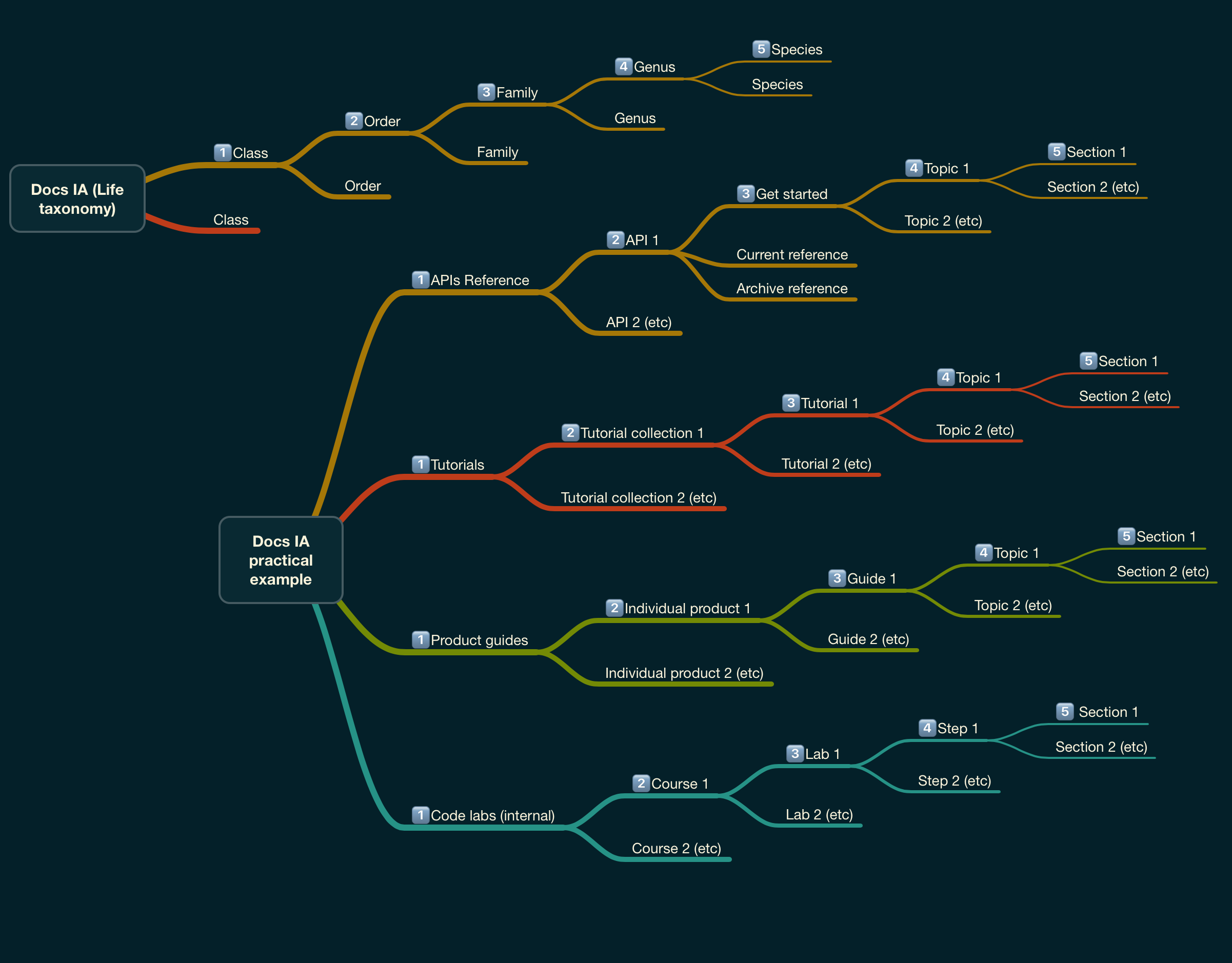
At the same time I also hypothesised on a plausible information architecture that may exist within a more fleshed out application.

Conceptualised IA for admin app

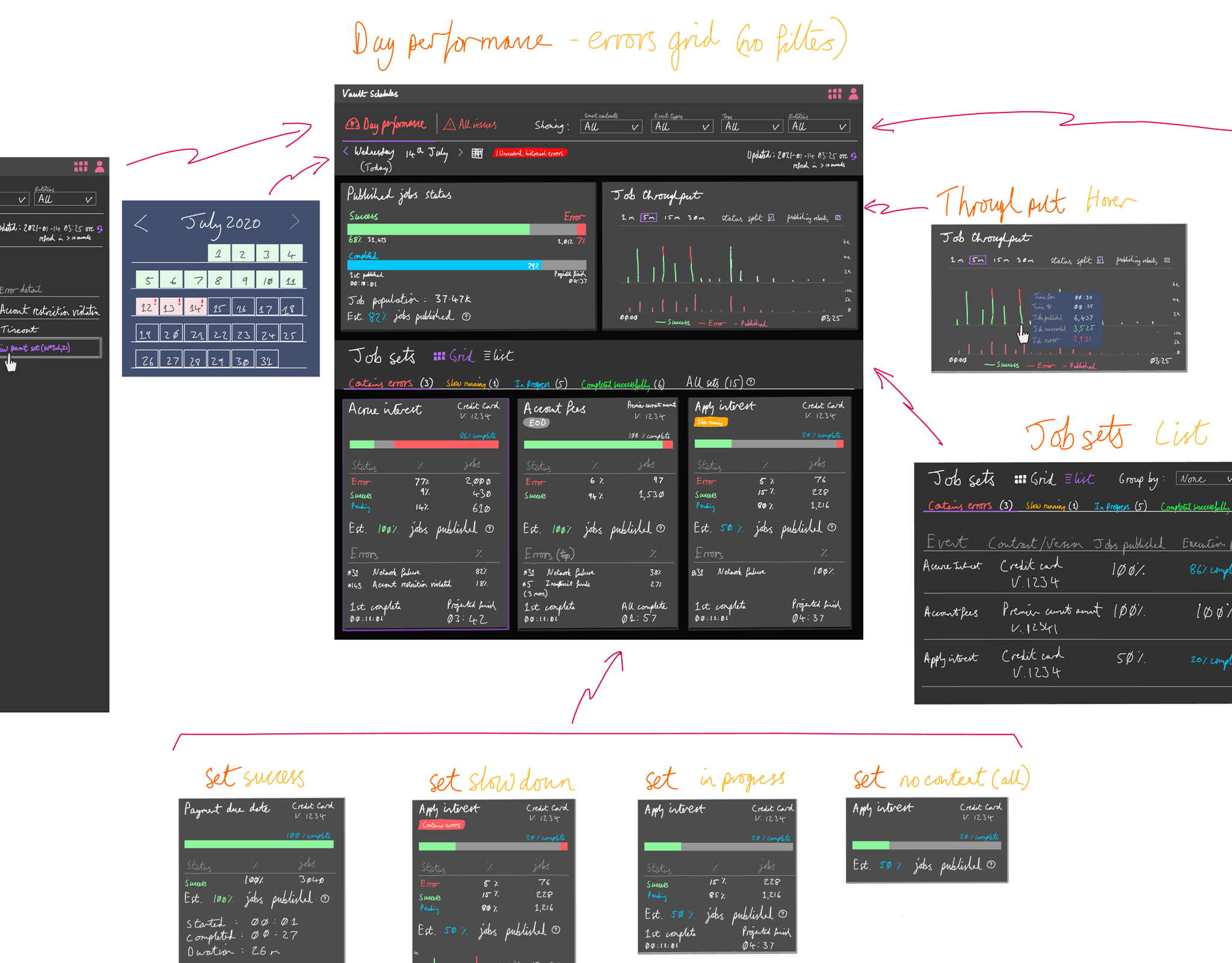
Before jumping into a hi-fi prototype it was necessary to rapidly create a set of indicative visual assets that could be use internally to both communicate to stakeholders a general direction and allow engineering to broadly size the effort that would be required to get to an MVP.
My preferred approach given these intermediate objectives was to digitally hand draw to a mid-fi level. This technique allows me to explore concepts with the flexibility of being hand drawn, while also making iteration quick and painless. Assets can be easily added to Figma and wired together to create a first draft prototype if needed. In this case I ended up doing this step so that we could work with our onboarding and sales engineering teams to further refine the concept.

Mid-fi examples

Full set of mid-fi prototype assets

The mid-fi played an important role in the immediately following phase. Although the prototype only took two days to put together, our engineering team were able to provide high level sizing. My team were also able to use extracts to brief exco and in turn the board on the intended direction.
With the necessary support combined with optimisation feedback from internal SMEs I was able to move on to a hi-fi figma prototype.

Hi-fi Figma prototype example assets

Prototype demand test outcome
With the prototype complete we were able to schedule and carry out showcase sessions with integration teams from two of the Big 4 consultancies as well as two further more specialised tax consultancies. 
The signal we received was mixed. The concept itself was well received and the UX/UI demonstrated was clearly understood. With positive commentary that such a proposition would indeed lower the integration barrier and make our product set more appealing to more traditional enterprise firms. However beyond the appeal of the prototype and underlying capability, there was a more macro headwind that with the growing threat of recession, change projects within enterprise were being cancelled or pushed back. This combined with a general move to de-risk meant that our ability to displace the incumbents was going to be more difficult in the short term, despite our superior and disruptive tech.
The net result of all our discovery work was the decision from our exco to put this project on hold and shift focus to levelling up client UX and at the same time make tactical use of spare engineering capacity to create a proof of concept for colleague self-service tooling.
Admin app - colleague self service POC
Following our internal showcase of workflows within an admin app, I was able to partner with our platform team and help bootstrap a flexible admin app shell for future use. The idea being to pre-load the fundamental building blocks - such as single-sign-on, roles and permissions, navigation patterns and page layout templates. From this framework other engineering teams would be able to develop tooling for colleagues to better service our clients.
In order to better bring the framework to life I was able to join our reporting product team for a couple of weeks to rapidly design and handover an implementation spec for the first tool that would be used in anger by our client support colleague as soon as it was ready.
The tool would replace a lengthly manual process with a basic UI coupled with behind-the-scenes automation.

Extract examples from colleague tooling POC implementation spec

In the first month of use following launch of this first simple tool it was estimated that the client services team saved at least 30 hours of work. While the reporting engineering team took back at least 10 hours.
We took time to socialise this success with the other engineering teams. Off the back of which, all teams committed to further tooling builds within their short term roadmaps. 
Customer dashboard & data value add
In parallel with working on self-service tooling, I also partnered with Fonoa's UXR lead to investigate the question of value-add data. The main question we had was what were the top priority pain points enterprise tax tech teams have that we can remove through the right data connections and associated presentation. We knew from earlier research that tax teams were often under resourced and only able to operate reactively for the most part. We also knew that these teams wanted to be able to more easily gather insights from large tax data sets - so that they could create value through proactive tax advisory work.
To kick things off here we gathered the wider team, plus internal tax tech specialists, to to brainstorm pain points.

Pain points from workshop

In a second session we did a prioritisation and convergence exercise, largely led by findings from external interviews. The outcome was a set of three possible feature areas we could feasibly address with data we had and give us opportunities for value creation.
1. Comply with external/internal audit requests;
2. Monitor VAT registration threshold breaches;
3. Compliance level monitoring (incl. anomaly alerting).

Rough journey mapping of priority areas

Validation work
In a similar vein to the admin app, here again we wanted to use design prototypes to validate our direction and ensure that both our prioritisation work and UX thinking were on track.
This was also a big design task which I could no complete alone. To help me another product designer was initially brought in, with a third joining some weeks later. Together we explored a variety of plans and concepts, marking our work with various assets that were shared with the wider team for feedback.
These included storyboarding for a possible on-stage demo - where we initially thought to inject some of the previous work on workflows. We also went through numerous iterations of IA and navigation for a refreshed client dashboard app.

V1 storyboard for possible on-stage demo at launch

Early thinking on new dashboard IA

Proposed navigation for new dashboard app

Through internal testing of our IA and storyboard we were able to determine two important observations: 
1. The problems we had prioritised to solve were legitimate and value generative;
2. Implementation would be feasible - although not without some challenge.
Another piece of feedback we received was that many of our colleagues would benefit from a visual reference. The concepts in play were complex and and some cases fairly experimental and as a result I was asked to bring the proposed work to life with a concept design. The hope being that with the aid of visual assets, we would be able to get more actionable feedback.
Following a series of lo-fi sketching I produced the following concept for both the dashboard and data table aspects of the refreshed app:

Concept design to aid validation work

This concept design had two immediate benefits:
1. Our tax SMEs were able to give much more detailed feedback on data display, content hierarchy and user journey - which we could use to take our data design and UX forward;  
2. Our front-end platform team could see the design direction and get a sense of possible new component builds as well as existing design system updates.
UI convergence
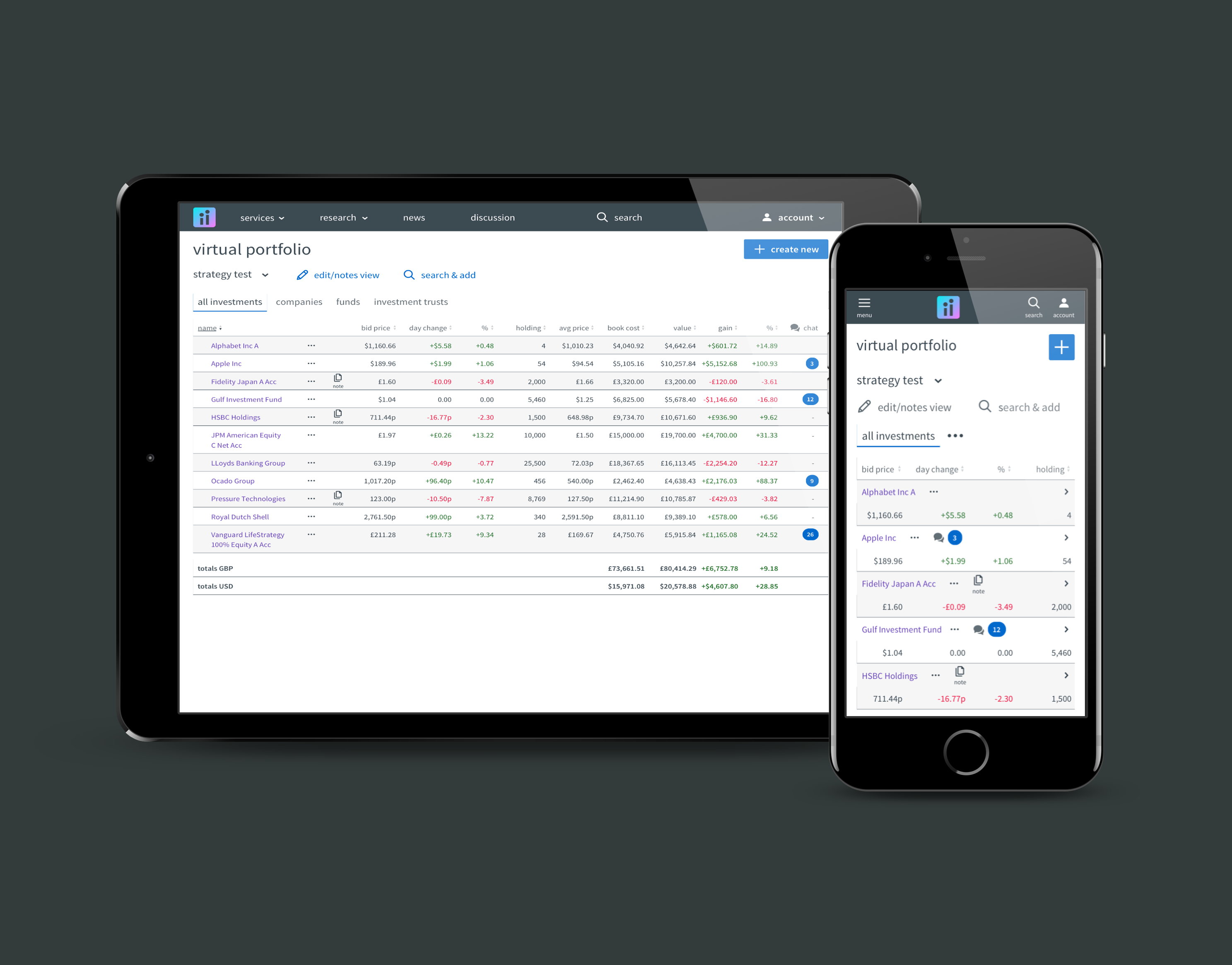
At this point I was able to hand dashboard design refresh work off to my two product design colleagues. While they sought to refine the design and do user testing, I worked closely with the front-end platform team on tactical improvements to our design system. Here the main focus was on improving the presentation and utility of our data tables - as we had feedback from many that usability was not where it needed to be. 
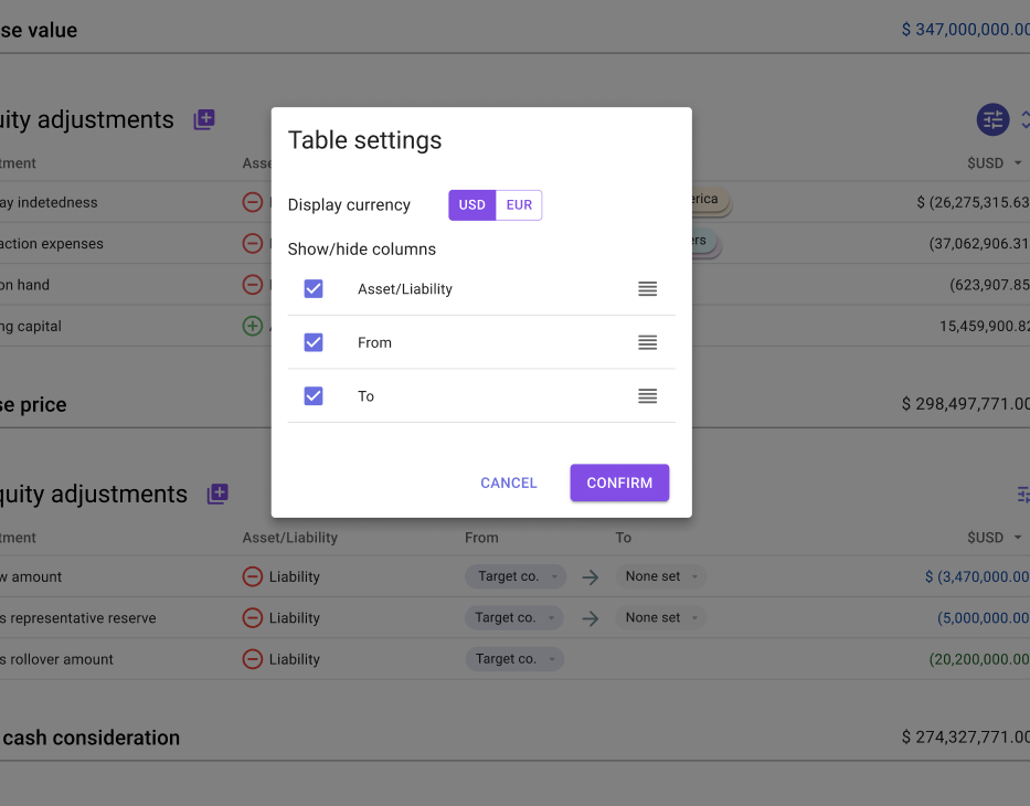
My first step here was an audit of existing table use. From here and based on my previous experience work on complex tables, I was able to make a host of UI and UX recommendations culminating with a set of  data suggestions to product teams and design system artefacts for platform level implementation.

Design system artefacts examples for data table uplift

The outcomes of this tactical work on table uplift were positive. 
The platform team were able to centrally revise and deploy within 2 sprints. The product teams were also able to largely act on advice, including data ordering and interaction patterns in a similar time frame as the changes were not breaking.
Feedback from internal and client users following release was also positive. As expected the simple act of having a more compact presentation, that more closely mirrored spreadsheet tools, gave the UI a more familiar feel. The techniques used to enable more data columns to be in view for a given viewport size was also greatly welcomed as efficiency of use increased.
Data design
The final step of my work on this project was to lead the data design. As detailed in the strategy, the intention was for each product to start emitting data events which would be aggregated and structured within an eventually consistent database. This new db structure would in turn enable the queries needed to deliver the intended dashboard capabilities and UX. 
While everyone understood this plan, it was not clear to the wider teams what data would be needed and what structuring would need to take place. I took on this analysis task given my prior deep dives into both our APIs and plans for the new app.
Following high level consideration of data requirements, the task became to arrive at a set of data that we wanted to consume and from there what forms of data aggregations would be needed to deliver the intended metric displays within the front end.

Data requirements across the indirect tax lifecycle

Low level data audit + translation requirements

Data design outcomes
Through this analysis and requirements creation work we were able to achieve four valuable outcomes.
1. The product designers knew with more certainty what data would be available to include within their design work;
2. The platform team were able to better define the message structures within the model catalogue;
3. The product teams could schedule the work to create the necessary events within each product;
4. The database engineers could make decisions on db structure and make a start on build.

More projects