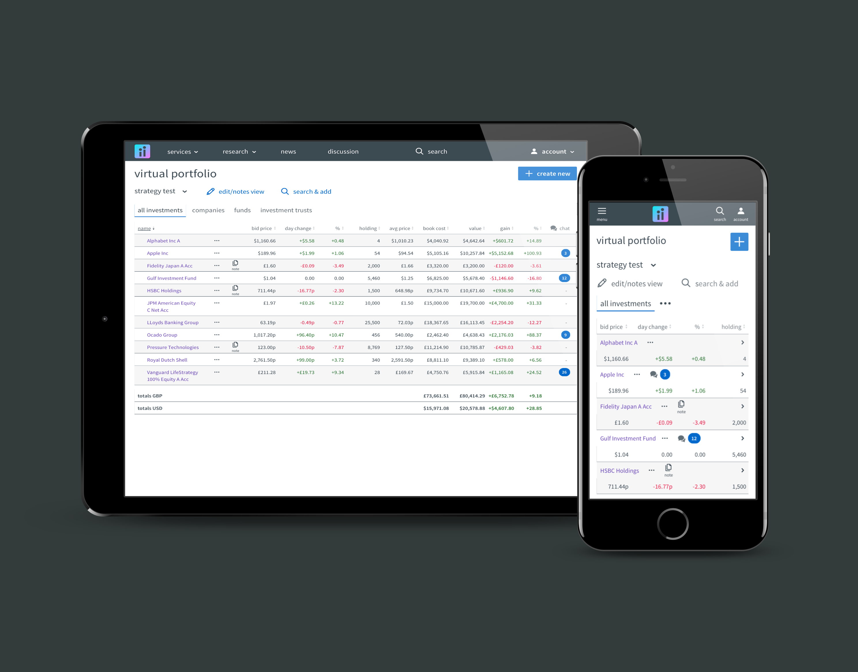
SIPP stands for Self Invested Personal Pension and it is certainly the most complicated type of account offered by ii.co.uk. This project was focused on tactical UX improvements and UI re-design for the web forms used by customers when applying for a SIPP account.
The project team was small and assembled at short notice. Our senior stakeholders gave the team two objectives:
1. Improve conversion rates
2. Increase mobile applications.
Competitor & internal analysis
The account opening for SIPP is a complicated process which involves connections to one internal and three external APIs. It also involves a considerable number of permutation of question/answer and much scrutiny from both compliance and anti-money-laundering teams.
As a result the project team knew that any significant changes would need strong arguments...and one of the strongest comes from what competitors, who are subject to the same regulations, do. For this reason we began with competitor analysis and looked for positives/negatives we could learn from.
We looked at 8 of our competitors. Here is a sample of that output:
Hargreaves Lansdown account opening
AJ Bell account opening
Nutmeg account opening
The team workshopped the positives and negatives from our competitors, making a list of improvements for consideration. Next we looked inward and did a review of the current SIPP account opening, which at the time was still branded as TD Direct (a business that had been recently acquired).
We considered the design shortfalls and also the analytics data on which pages/questions were acting as barriers to conversion.
Current SIPP page-by-page critique example
The output of this analysis phase was a long list of features & principles for consideration. To help with prioritisation we mapped these onto a impact/effort matrix.
principles impact/effort matrix
Flow optimisation
Based on our analysis data and our principles matrix, we wanted to re-consider the current web form flow from a perspective of what we could remove/simplify. We also looked at how to split the forms in such a way as to increase entry speed and user comfort.
We started this by workshopping on the whiteboard.
V1 page flow for SIPP application
Proposed SIPP question groupings V1
Questions for challenge
We needed to take our version 1 artefacts to a number of internal and 3rd party stakeholders and once concessions were agreed we took our planned flow to a v2:
SIPP flow v2
Two killer features
1. A different approach to permutations logic...
One area of the SIPP application involved a number of permutations around the circumstances of the applicants retirement. The pervious process used multiple logic jumps with in-line reveals within the web form. The team felt this resulted in a lot of "jumpy" UI, which combined with some complex questions was generating significant abandonment.
My proposal was to restructure the logic and create two simple binary choice questions. These would then setup the subsequent forms without need for complex reveals.
Here is my initial logic tree and UI sketch:
SIPP KFI logic tree
KFI setup sketch
2. Silent save and resume
Another feature the team were keen to introduce was a silent mechanism where the progress of the applicant would be stored for a period and an email triggered to invite the user to resume if they wish.
It was hypothesised that due to the complexity of the form there would be many users who would exit the session without completion due to interruption or not having the information needed to hand.
This feature had been tried before but it was broken at the time and even when working it was very convoluted for the user to resume. We designed a new process and flow for this as a tactical enhancement.
SIPP save and resume flow
Form interface design
Given our challenge to improve mobile device applications, we made the decision to take a mobile first approach to our form design. We also wanted to make sure that the user would be able to tell at a glance where they are in the form, what fields have been completed and what still needed completion.
We also wanted to make sure that we were using simple explanatory language where needed to limit user anxiety. Lastly we wanted to make sure that our design patterns were consistent all the way through the flow.
With these plans in mind the first step was to confirm the design system that we were going to use as our base.
Extract from our design system
I then created a series of hi-fi designs for the end-to-end process for internal review and dev handoff.
SIPP application 1st step (empty & complete)
A more complete set of hi-fi designs for SIPP application can be found here.
Note that, although my preferred approach when showing designs to stakeholders and our devs is to talk through the artefacts in person and collectively agree success criteria, I do occasionally add annotations to both low-fi and hi-fi designs if required...
low-fi with annotations
Hi-fi with annotations
Project outcomes
The project was completed successfully on time and although not all of the planned enhancements made it into the sprints, the team and I were pleased with the outcome.
Of course the success of the project would ultimately be determined by the conversion data. Here the story has so far been encouraging, since the launch we have seen:
1. Conversion from existing customers increased by 15%.
2. Mobile device applications doubled to account for 19% of applications.
3. Silent save and resume contributed an additional 10% to overall conversion rates.


